Hidden Art (The Art is Hiding)
I’ve joined an online blogging book club! I’m very excited to get started, but I’m still waiting for my book to arrive. In the meantime, I’ll post a link to my mother’s blog and her post on Chapter 1 of Edith Schaeffer’s classic!
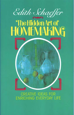
I will say one thing: before even opening the book, I am not drawn to the cover. Being a designer by trade, I’m one of those visual people who almost always judges a book by its cover (in the most literal sense, not using the phrase metaphorically here). If a book has beautiful or interesting cover art, I’m more likely to pick it up! And I’d be willing to bet the general public mostly agrees (otherwise, they wouldn’t pay people like me to design eye-catching covers). Obviously the author’s name and reputation speaks for itself, but I’m surprised that since its original publication in 1972, this book hasn’t had a little refresher. The color scheme (teal green, neon yellow and fuschia?) screams 1970s to me. Does anyone agree? Even the muted alternative featuring the same still life (shown below) seems a little bland. The opportunity to make this cover a work of art really is hidden! I may have to take on a personal Hidden Art re-branding project as the reading commences. 🙂 Stay tuned for my post reviewing the first chapter of The Hidden Art of Homemaking!


Leave a Reply